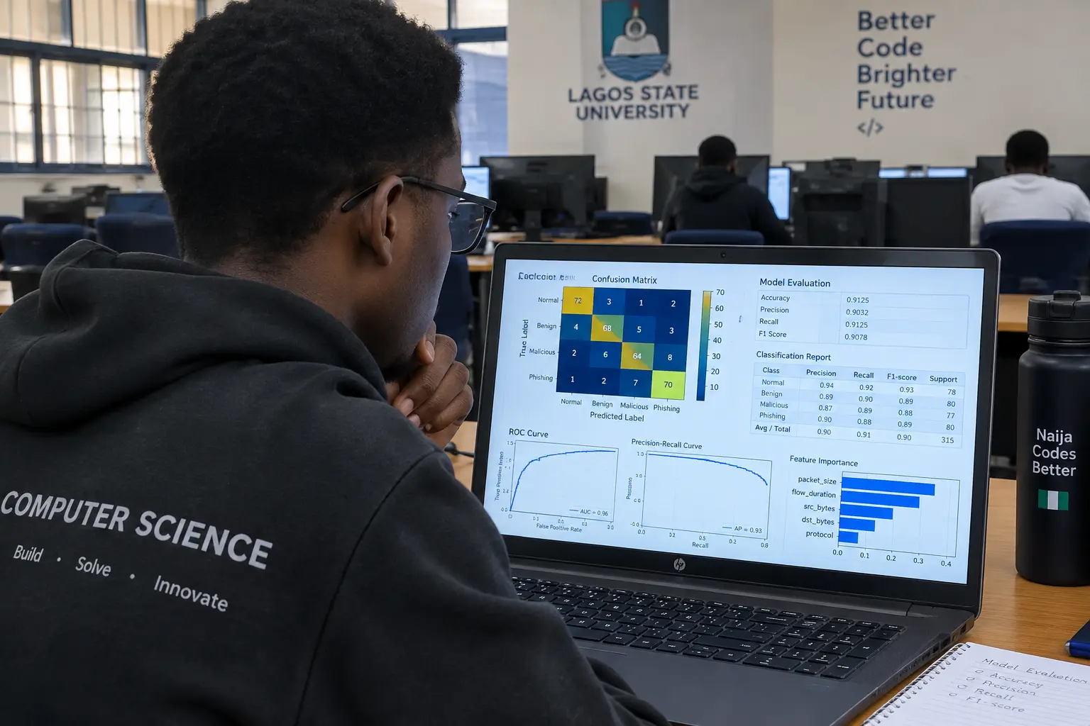
Reporting accuracy alone is one of the most common reasons a data science or AI project’s Chapter Four gets sent back — on an imbalanced dataset, a model that predicts the majority class every time can score 90% accuracy while being useless, and a panel that has seen this before will ask for the confusion matrix before anything else.
Metrics by Project Type
| Project type | Metrics to report | Why accuracy alone is not enough |
|---|---|---|
| Classification (fraud detection, disease prediction, sentiment analysis) | Confusion matrix, accuracy, precision, recall, F1-score, and ROC-AUC where the problem allows a probability threshold | On an imbalanced dataset (rare fraud cases, rare disease cases) a model that always predicts “no” can score high accuracy while never catching a single true case |
| Regression (price prediction, demand forecasting) | RMSE (root mean squared error), MAE (mean absolute error), and R² (coefficient of determination) | A single R² figure does not show whether the model’s errors are consistently small or occasionally very large |
| Clustering (customer segmentation, unsupervised grouping) | Silhouette score, and a labelled visualisation of the resulting clusters | There is no single “accuracy” figure for unsupervised learning; cluster quality has to be shown, not just stated |
| NLP / text classification | The same classification metrics above, plus example predictions on real (or illustrative) text showing correct and incorrect cases | A precision/recall table alone does not show a reader what kind of text the model actually gets wrong |
Why Accuracy Alone Fails on an Imbalanced Dataset
Most real-world Nigerian datasets a student builds a project around — loan default, disease diagnosis, fraud detection — are imbalanced: the outcome you actually care about (the default, the disease, the fraud) is the minority class. A worked illustrative example, not a real result: a dataset of 1,000 transactions with 950 legitimate and 50 fraudulent, and a model that predicts every single transaction as “legitimate,” scores 95% accuracy while catching zero fraud cases. This is exactly why a panel asks for the confusion matrix and the recall figure specifically — recall on the minority class tells you what accuracy alone hides.
How to Present a Confusion Matrix
A confusion matrix is a table, not a narrative paragraph: rows for the actual class, columns for the predicted class, with the four cells (true positive, false positive, true negative, false negative) filled in as counts. Present it as an actual table or a labelled heatmap figure, never described only in prose (“the model correctly predicted most cases” tells a reader nothing a table would show in one glance). From the confusion matrix, calculate and report precision (of everything the model predicted positive, what proportion was actually positive), recall (of everything that was actually positive, what proportion did the model catch), and F1-score (the balance between the two) — state the formula you used for each, since departments vary on whether they expect the calculation shown or only the result.
Reporting Your Train/Test Split and Cross-Validation
State explicitly how you split your data before training: the proportion used for training versus testing (a common convention is 70/30 or 80/20, though your specific split should be justified by your dataset size), whether the split was random or stratified (stratified split preserves the class proportions in both sets, which matters on an imbalanced dataset), and whether you used a single train/test split or k-fold cross-validation (which trains and tests the model on several different splits and reports the average performance, giving a more reliable estimate on a smaller dataset). Report this in Chapter Three as part of your methodology, alongside the system development approach covered in our comparison of SSADM, waterfall, Agile and prototyping, and refer back to it in Chapter Four when you present the results it produced.
Comparing Multiple Models
Where your project compares more than one algorithm (a common design: logistic regression against a decision tree against a random forest, for example), present the comparison as a single table with one row per model and one column per metric, so a reader can see at a glance which model performed best on which measure — a model rarely wins on every metric at once, and stating which trade-off you chose and why (higher recall at the cost of some precision, for example, if catching every case matters more than avoiding false alarms) is a stronger Chapter Four than simply naming the highest-accuracy model as the winner without discussing the trade-off. Where two models score close to each other, state that plainly rather than treating a one-percentage-point difference as decisive — a small difference on a small test set can easily be down to which specific records ended up in the test split rather than a genuine difference in the model’s underlying quality.
Feature Importance and Explainability Figures
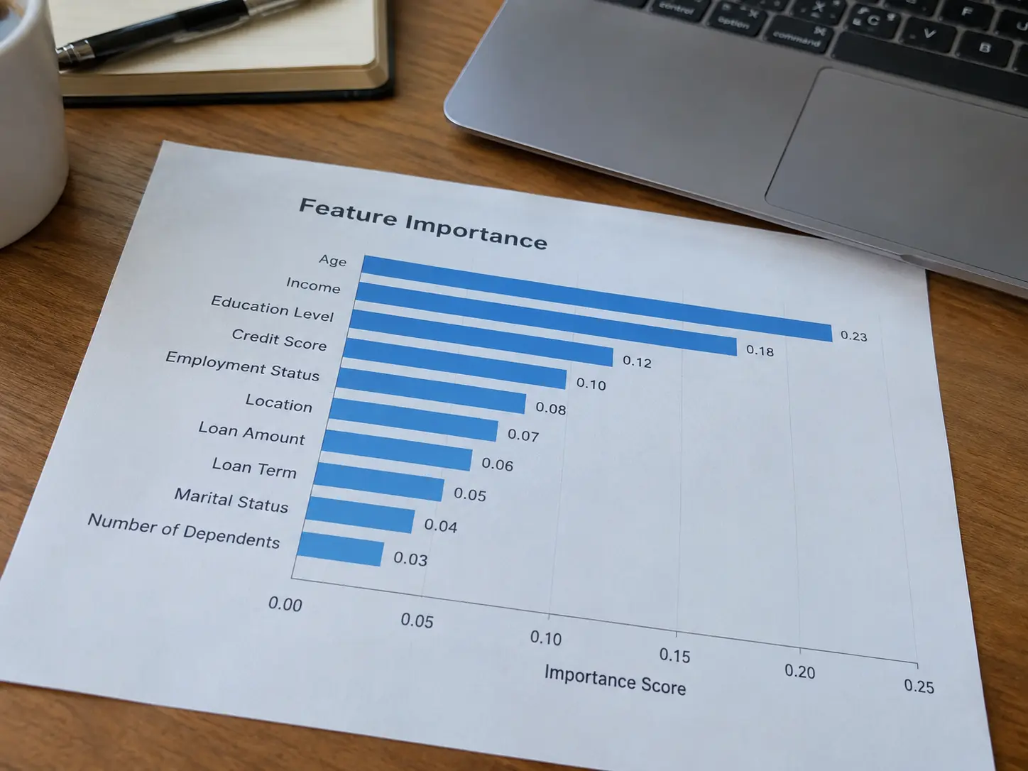
Where your model allows it (tree-based models, logistic regression coefficients), report which input features contributed most to the model’s predictions, usually as a ranked bar chart of feature importance scores. This section is worth including in a data science or AI project because it answers the question a panel is likely to ask regardless of your model’s accuracy: not just whether it works, but why it works, and whether the features it relies on make substantive sense for your problem rather than being an artefact of your specific dataset.
Other Figures Worth Including
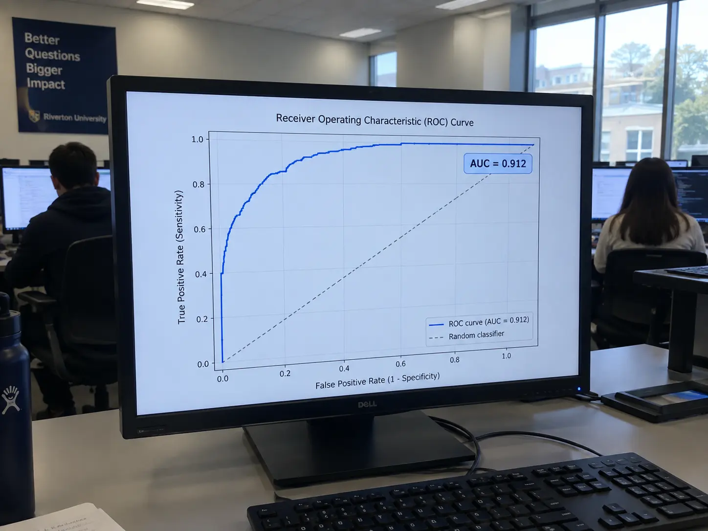
Beyond the confusion matrix and feature-importance chart, a few other figures strengthen a data science Chapter Four depending on your design: a learning curve (training and validation performance plotted against training-set size) shows whether more data would likely improve your model, or whether it has already plateaued; a ROC curve (true positive rate against false positive rate across every possible classification threshold, with the AUC value stated directly on the figure) shows how your model performs across thresholds rather than at just one fixed cut-off; and for a regression project, a predicted-versus-actual scatter plot shows at a glance whether your model’s errors are randomly scattered or systematically biased in one direction, which a single RMSE number cannot show on its own.
A Worked Illustrative Example
The following is a labelled, illustrative example, not a real result. A student building a loan-default prediction model on an illustrative dataset of 2,000 records (1,800 non-default, 200 default) uses a stratified 80/20 train/test split, trains a logistic regression and a random forest, and reports both in a comparison table: logistic regression achieves 88% accuracy but only 42% recall on the default class, while the random forest achieves 85% accuracy but 71% recall on the default class. Because catching a genuine default is more important to the project’s stated objective than minimising every false alarm, the discussion states explicitly that the random forest is the better-performing model for this specific objective despite its slightly lower accuracy, and the confusion matrix and feature-importance chart for the random forest are presented as the primary results, with the logistic regression comparison included to justify the choice.
Graphing Conventions for Data Science Figures
Label every axis with the variable and its unit or scale, state the sample size the figure is drawn from, use a consistent colour scheme across every figure in your results chapter, and caption each figure with what it shows rather than leaving the reader to infer it from the surrounding prose. A confusion matrix heatmap should state both the count and, where useful, the percentage in each cell. A ROC curve should include the AUC value directly on the figure, not only in the surrounding text.
What to State in Chapter Four
Open each results sub-section with the metric table or figure, followed by a short interpretation paragraph that states the finding in plain language, situates it against your research question, and, where relevant, compares it to what a similar published study found — the same three-move structure (state the finding, explain it in your setting, connect it to the literature) used for a survey-based Chapter Four applies equally to a model’s results. Our general guide to writing Chapter Four covers this structure in full, and our guide to writing the limitations section of a computer science project covers how to state the scope your model’s results do and do not support, including dataset size, class imbalance and any features you could not include.
Once your models are trained and your metrics are calculated, Tesify helps you write up the results chapter in a structure your department expects, keeping your Chapter Three methodology and Chapter Four results consistent with each other. Start your data science project with Tesify — over 9,000 students and 15,000+ chapters written, 100% written by you.
Frequently asked questions
Is accuracy ever enough on its own for a classification project?
Only on a genuinely balanced dataset where every class is roughly equally represented, and even then a panel generally expects the confusion matrix and precision/recall figures alongside it, since accuracy alone does not show which kinds of errors the model makes.
What is the difference between precision and recall?
Precision measures how many of the cases your model predicted as positive were actually positive; recall measures how many of the actual positive cases your model successfully caught. A model can have high precision and low recall, or the reverse, and the trade-off between them should be discussed explicitly.
Do I need to explain the maths behind precision, recall and F1-score?
State the formula for each metric, since some Nigerian departments expect it shown explicitly, and check your own department’s convention before assuming it is optional.
How many models should I compare in my project?
There is no fixed requirement, and a single well-evaluated model with a clearly stated confusion matrix and metrics is often stronger than a poorly justified comparison of several models; two or three models compared on the same clearly stated metrics is a common, defensible design.
What if my model’s accuracy is lower than I expected?
Report it honestly and discuss why, referring to your dataset size, class imbalance, feature selection or the inherent difficulty of the problem, rather than adjusting your evaluation method until a higher number appears; a modest, honestly explained result is stronger than an inflated one a panel can pick apart.
Should I include the confusion matrix as a table or as a figure?
Either is acceptable and many projects use a labelled heatmap figure for visual clarity alongside the numeric table; whichever you choose, state the counts explicitly rather than only a colour gradient without numbers.
Is a ROC curve necessary for every classification project?
It is most useful when your model outputs a probability and you are choosing a classification threshold; for a simpler classification problem without a meaningful threshold decision, precision, recall and F1-score alone may be sufficient, depending on your department’s expectations.
How do I report results for a model with more than two classes?
Use a multi-class confusion matrix (one row and column per class) and report precision, recall and F1-score per class, along with a macro or weighted average across all classes, stating which averaging method you used.
What does a learning curve tell my panel that a single accuracy figure does not?
It shows whether your model’s performance is still improving as training data increases, or has already plateaued, which speaks directly to a common defence question: would more data have improved this model, and did you check?
Should I report results from every model I tried, including ones that performed poorly?
Reporting your final, best-performing model in full is the minimum expectation, and briefly noting other approaches you tried and why they were rejected (in a comparison table or a short paragraph) demonstrates a more thorough methodology than presenting only the winning model as though it were the only one attempted.